Coca Cola Has Done It Again With Interactive Construction
Coca-Cola's annual advertising budget is said to be more than 4 billion bucks. That leaves a lot of room for experimentation, and they're happy to be on the cutting edge. Here, the soft drink company used the side of a building under construction. They didn't ignore that fact, though. They used it to their advantage! Here, an illustrated crane picks up one of the coke bottles to carry it away.
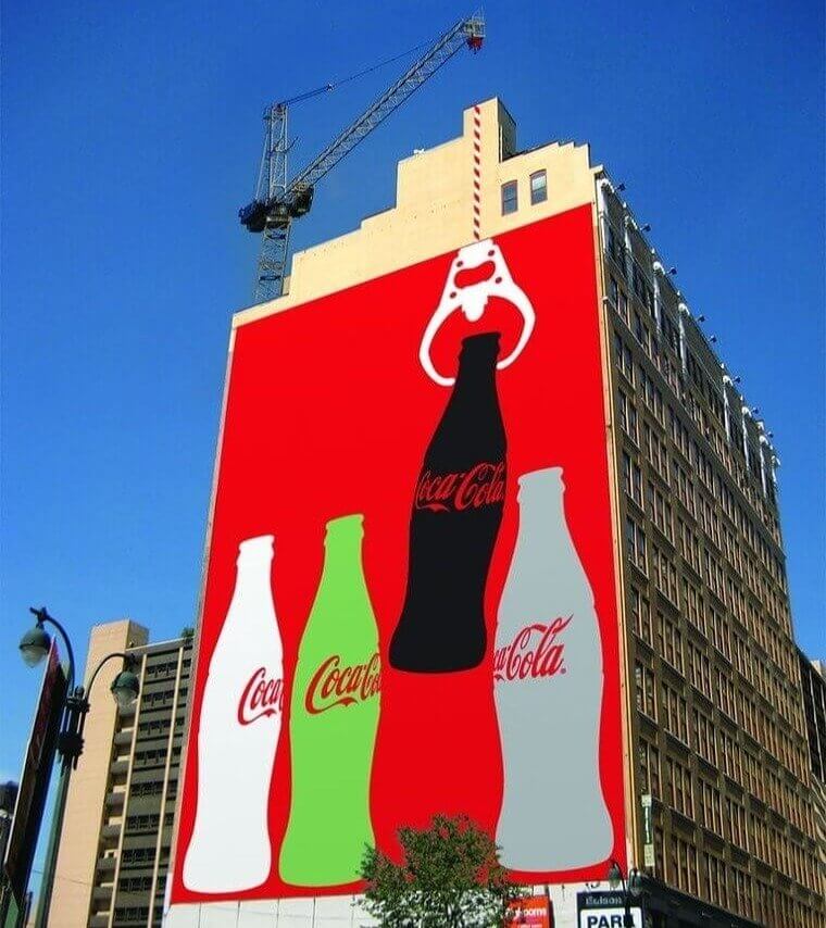
As you can see, that concept blends in perfectly with the real machine working above the ad. Admittedly, this will only work for a little while. When the building is finished, so is the ad. It's unique, though!
Axe Made These Ordinary Windows A Little Less Ordinary
The brand AXE has had iconic ads for years. Everyone remembers its original commercials telling you that smell is the strongest sense tied to memory. What concept are they trying to communicate here? Well, it looks like they want their male customers to imagine a brand new social calendar. If you buy their man scents, you might just get appointments with the ladies that could fill the windows of this building!
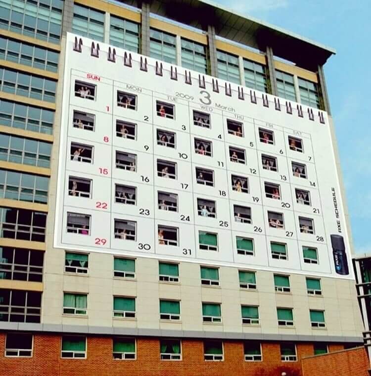
It's clever because the layout of the building really does look like an actual calendar page. We are not sure if the product will deliver dates, but we do love the marketing.
This Conditioner Wants You To Know It Untangles Anything
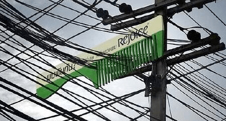
Knots and hairballs are no way to live, and Rejoice Conditioner agrees. To show customers that its formula can separate even the toughest strands, it has installed a real attention grabber in the city. Not all billboards take the same form. This one is shaped like a comb and it has been carefully placed between telephone wires. We all know those are famous for tangles! The idea here is hard to ignore.
It's cute, sure. But hair is serious business. For those who already have their favorite brands, it might be too late. Rejoice is hoping to change your mind with marketing. Did their efforts work?
These Lights Do Create a Familiar Illusion
Depending on your location, your local Mickey D's might be open 24 hours a day. Some are only open until midnight. Regardless, the chain offers hours and hours of greasy possibilities. But with all the competing dinner options out there, it's easy to forget the Big Mac and Filet-O-Fish on the go. Thanks to this clever sign, we can't ignore McDonald's any longer. What trick have they employed here?
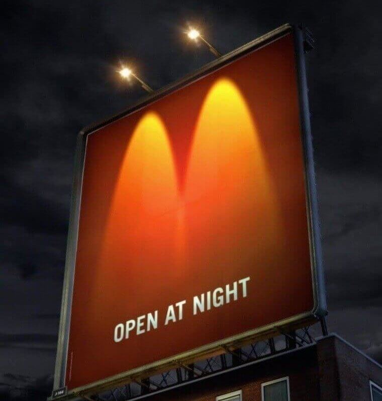
It looks like the sign would be blank during the day. But at night, two lights shining down in just the right way create the golden arches of their logo. Very nice!
This Giant Got Our Attention With Eight Arms
This creative billboard drew crowds at the 2008 European Cup, in Vienna. We never knew that Austria had such exciting ads! In this case, they used a famous face and a futuristic design. The man here is Petr Cech, one of the best goalies in the soccer world. He has eight arms, and they seem to be taking over this Ferris wheel. It's wild stuff! But what does he want you to do?
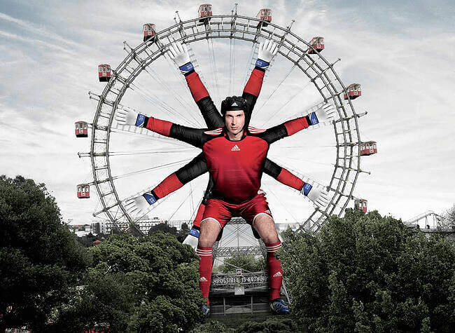
We are pretty sure this octopus man wants you to tune in to the tournament. If he promises to catch goals like this, we will consider turning off basketball. Maybe!
This Lego Ad Made Us Question Reality
Back in the olden days, kids were lucky to if they had simple, wooden toys. Thankfully, we're now in the age of colorful plastic. Based in Denmark, LEGO is actually one of the biggest exports of that country. The Lego Group claims to have produced 400 billion snappable blocks in the last fifty years. What we want to know is how many of those are currently lost behind couches. Seriously, where do they all go?
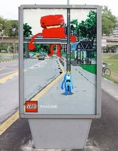
We don't know, whatsoever. But look at this recent street ad! The LEGO scene in the picture isn't real. But it merges with the real world like nothing we've ever seen.
We Couldn't Look Away From This Huge Hand
The world of tools is one that handymen know well. But most of us are still in the curious phase of our DIY journey. How can we know which brand has the most trustworthy tools? If Craftsman’s brand. has any say in the matter, you're going to go with them. Here, they have invested in a life-sized hand and wrench to make sure you know they have the best of the best near you.
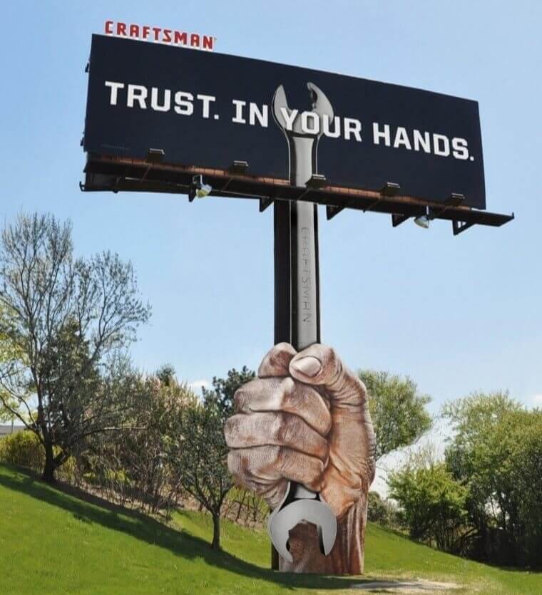
The ad is effective, in our opinion. Look at that firm grip. It's so confident! These tools will take you where you need to go, in terms of tightening things. Loosening things, too!
This Magazine Had a Bright Idea To Get Your Attention
The Economist is an influential publication in smartypants circles. It delivers all kinds of ideas to its readers, and some actually pay for subscriptions in a world of free media. But do people always remember to pick up a hard copy? Probably not. The ad department at this outlet decided that desperate times mean desperate measures. They decided to do a little something extra to stand out on the rack.
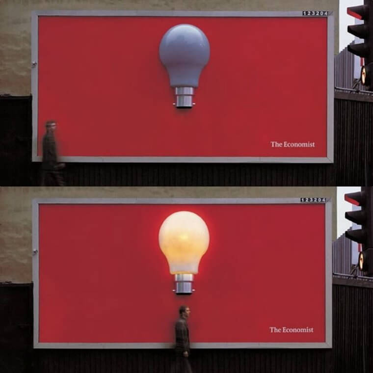
As pedestrians walk by, an actual lightbulb turns on above them. The idea is that they have a bright idea, and that's kind of charming. We've never seen a campaign quite like this!
You Just Can’t Escape Them
You might think we are making this one up. But no! Since its opening in 1948, McDonald's has sold more than 4 trillion fries, Not million, not billion. Trillion, folks! How did they do it? Maybe it's because of clever ads pushing them into your mouth. The creativity is admirable, and the frequency is inescapable. Here is a great example of marketing the same old potatoes in a brand new way. Look down!
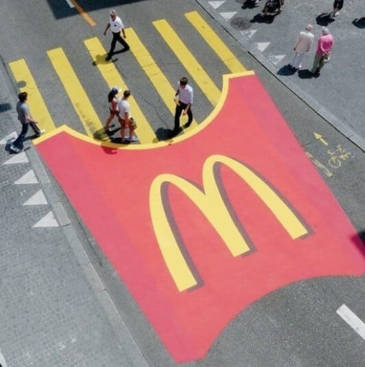
As people walk on the crosswalk, they might notice that the yellow lines have been transformed into fries. The carton extends across the street in bold red, and the golden arches are unmistakable. McDonald's strikes again!
This Store Does Always Bring Us Joy
As individuals, we love going to IKEA. There's no better way to blow a paycheck, and it's not going to stop anytime soon. Experts recommend that couples be careful at this addictive Swedish shop. Many a fight has occurred over the Lack series. This holiday season, the company wants us to put renovation arguments aside and just feel a little joy. According to this creative billboard, at least.
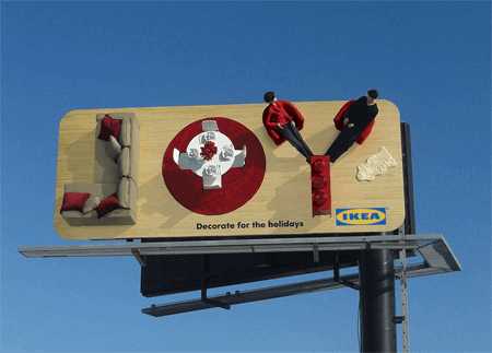
The functional design doesn't just happen in its stores. It seems IKEA makes its billboards smart, too. Just look at how they made a word out of people and furniture!
Why They Used Strings To Invite You to the Museum
Science World is a Vancouver-based science museum that teaches kids and adults alike. What's their favorite topic? Well, it's hard to say, since they have so many exhibits all year. But basically, it's science! The center does need to advertise to let visitors know what's up. This big ad got everyone's attention on the street with the appearance of human hair. Science World wants you to know that you grow 121 feet of hair per day. Wait, what?
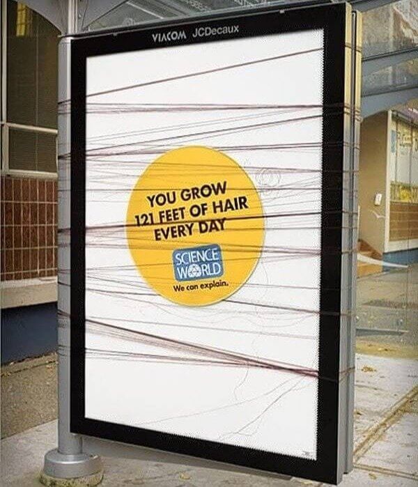
The fake hair they used was a gross touch. And we don't understand that claim at all. But maybe that's exactly why we need to go to this educational event.
There’s Literally No Way To Ignore This Rest Stop
According to road trip experts, there are over 2,000 highway rest stops across the United States. Maybe truckers have been to them all. But we certainly don't know the best place to grab a bite on the go, in the middle of nowhere. Here, an interesting use of a tunnel shows us the way. We not only know about the nearest snack, but we can enjoy a chuckle, too. Look, we're driving right into that lady's mouth!
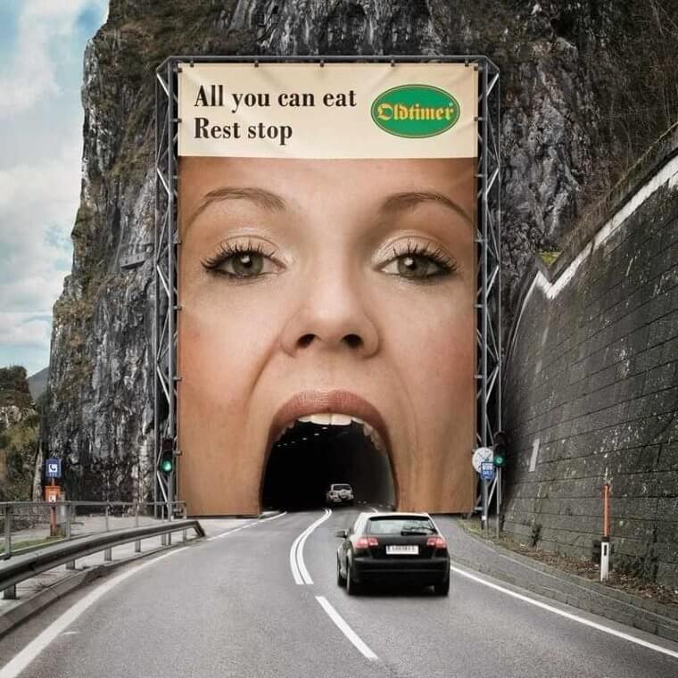
She must be hungry to gobble up all those cars. But with the help of this advertised eatery coming up on the side of the road, we won't have to do that.
This Might Make Your Cake Fifty Feet High
Cake bakers know that there are a few essential elements that go into any cake worth its sugar. You need some kind of flour, some kind of sweetener, and a few eggs. Nd then,. there's the baking powder. An underrated ingredient, it really brings cake to the next fluffy level. Here, Royal Baking Powder wants to put its name on the map as a brand. It has bought space on the side of this building and made the entire wall into a cake.
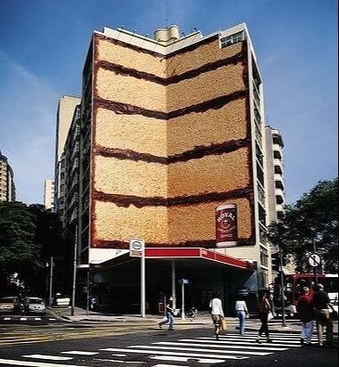
Each sweet section looks so scrumptious that you could forget you are looking at a nonedible image. Whatever you do, don't bite into the building. Samples are not being offered!
He Comes Out at Night on This Shadowy Billboard
Dracula is a drama-horror show on the BBC and Netflix. Of course, it's based on the famous 1897 Bram Stoker novel. If you've ever been intrigued by Transylvanian nobles, you might enjoy getting to know Count Dracula in his modern debut. This billboard advertised the show to pedestrians. But if they saw it in the morning, they might not get the creeps. In this case, that would be a shame!
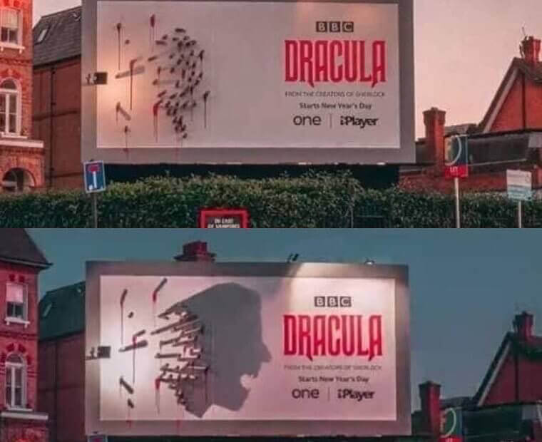
As the sun sets, the shadows come out to play. Here, they form the head of a screaming man. Is he running from a vampire? We want to know more, but we don't want to get bitten!
Hollywood Used the Escalators as a Clever Ad
Homer Simpson enlightened us with his musings about life and inspired us with his gluttony. He's the man who once pondered aloud: "Donuts. Is there anything they can't do?" When we heard The Simpson’s Movie was coming out, we knew there would be a little of both in the mix. Check out this ad the studio commissioned for the mall. We've got donuts galore, and they are flowing downward straight into Homer's mouth.
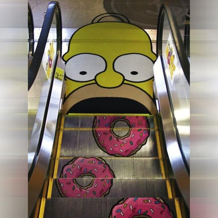
We think Homer himself would approve. He could never get enough of these. Now they're unlimited, all day long. Great ad, from our perspective, too. Hard to ignore when you have to walk on it!
Maybe They Used the Budget the Right Way
Big, beautiful billboards. We see them everywhere, but how much do they really cost? On average, traditional signs can cost between $750 per month and $14,000. And if they are digital? Well, that's a whole different ballpark. Those fancy ads can run from $1,200 to more than $15,000. That's per month, folks! Here, someone wanted to cut costs for their company without comprising on wit. What's their message to customers?
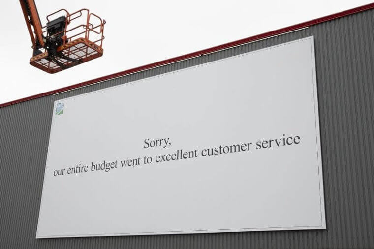
These mysterious entrepreneurs want you to know that they are spending their dollars on you. Customer service is way more important than a flashy ad, they say. We're inclined to agree. But they forgot their logo! Can we at least know who you are, nice company?
This Water-Sensitive Sign Made You Look
Calvin Klein is one of the biggest brands in the world when it comes to boxers, briefs, and bras. Today, it's time to remember how much we love their luxury brassieres. The giant billboard here is made of a special material that interacts with water. When it rains in real life, the shirt on the model goes transparent. Then, we get quite a show! Are you convinced to buy yet?
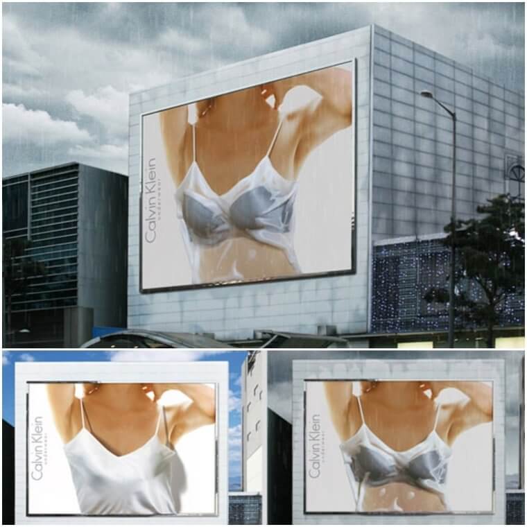
We wonder how people reacted when they saw this unusual ad go from nice to naughty. We also wonder if there were a masculine version! Now that would be a sight.
Now That’s a New Way To Mow the Lawn
It's a hairy world, and we just live in it. We're trying to do something about that, though! Ladies who hate their hairy legs apply a metal blade, day after day. Men take the risk of a sharp object right on their neck, to avoid that dreaded neckbeard. It's all risky stuff. Unless you have a trusty BIC razor, of course! The time-tested brand has made shaving accessible to millions, and they don't want you to forget they are still around.
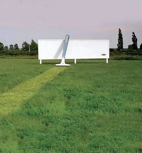
Here, a 3D razor has shaved the grass. Resting against a blank billboard with a small logo. the message is clear. BIC is sharp enough for real grass. Surely it can handle human hair!
The Colorado State Patrol Has a Creative Message
The Colorado State Patrol deals with a lot of accidents on the road. It's a sad but true fact. To get the attention of drivers, they decided to create a billboard about the dangers. Any car can become a convertible, they say. Think about it, and you will realize they are right: Driving under a low bridge or too close to a big truck that suddenly stops could shave off the top of your car. Hopefully, that will never happen!
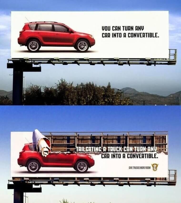
There is no way to prevent all accidents. You're always taking a risk in that 3,000-pound hunk of moving metal called a car. But this sign is hard to miss, and it might make people more alert, at least for a bit.
Sun Chips Has a Message With Real Sun Here
Sun Chips are delicious, though not necessarily nutritious. Consumers know that, and the brand wants to make themselves seem like a conscientious choice, anyway. They've made a big move: In recent years, they changed their manufacturing process to go greener. To be specific, Sun Chips use solar power instead of coal-powered electricity at one of their plants. And indeed, it seems to fit the name. How did they let everyone know about this fact?
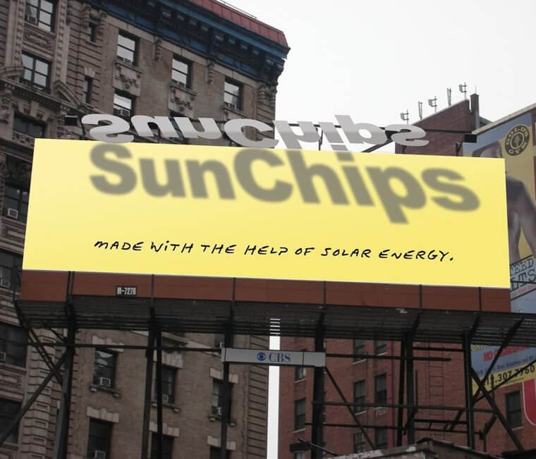
This Sun Chips billboard creatively used the power of the sun to emphasize their brand. When it's high in the sky, the shadow creates a double of their name. How novel!
We Swear This Ship’s Rope is Spaghetti
Pasta is beloved the world over. Besides the crazy keto crowd, pretty much everyone eats pasta pretty frequently. Every culture seems to have its version, whether what or rice. Mondo is a brand that wants you to know that it has the best strings of dough around, and it has employed a pretty special 3D ad to explain. Look at this rope! It looks just like a piece of spaghetti.
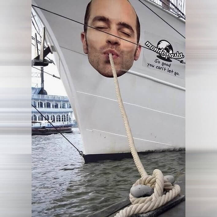
On the side of a ship, it's going to get a lot of views, too. A moving ad is a smart idea, and we think more brands should take note. Ahoy, Mondo!
This Billboard Makes You Think About Things Very Literally
No one likes dropped calls, to put it mildly. If you're paying for a service that lets you keep a tiny little phone in your pocket and use it anywhere, you better get it. It's supposed to work like magic. But sometimes, it works like garbage. Cingular Wireless wanted to let its potential customers know that it feels their pain. With this giant billboard, they depicted a literal dropped call. Silly Cingular!
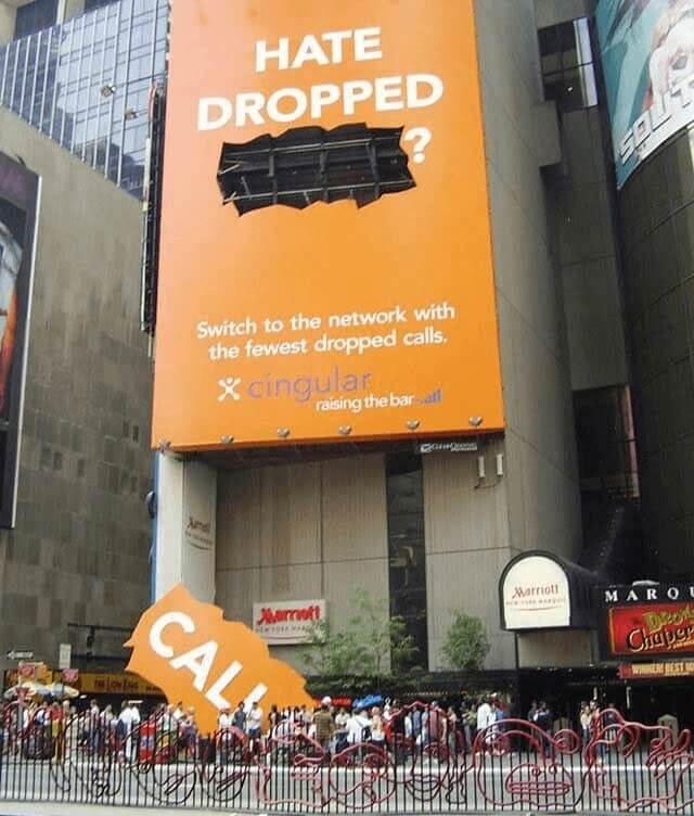
We see the word has dropped off the page straight onto the cement below. Hopefully, no one was there when it happened! If they merely hated dropped calls before, they are sure to be enraged now.
It Was All Unwrapped in a Series of Three Billboards
When you say chocolate, it doesn't take much to get our attention. But one company decided it wanted to stand out among all choco events going on in the city. We don't even know if there were others, but The Denver Museum of Nature and Science is now on our calendar. The name of the event is "Chocolate, the Exhibition". Pretty direct, and very to the point. We are intrigued!
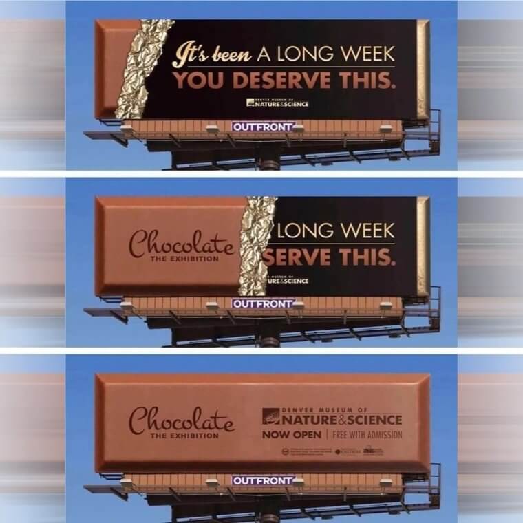
As you move along the road, you are greeted by not one, but three giant candy bar signs. The wrapper slowly gets ripped, and the full details are revealed at the end. Delicious!
These Giant Nose Hairs Are The Stuff of Nightmares
Truthfully, some of us are hairier than others. Do you have armpit hair? Probably. What about nose and ear hair? That you may not as readily admit. It's just not attractive, in any culture so far. This ad for Panasonic trimmers is the perfect way to tell the furriest customers that they matter. Even if your nose is sprouting 50 feet of whiskers, these trimmers are here for you. Snip confidently, and electrically!
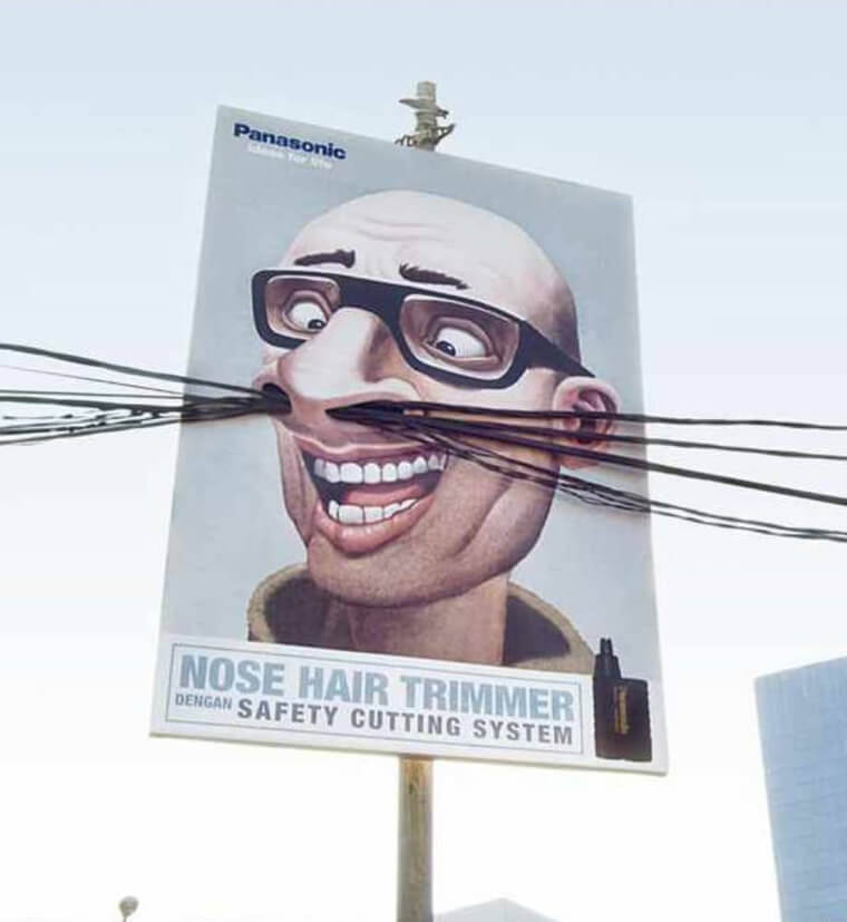
We love that this billboard doesn't even try to stay on the sign. It almost ventures into traffic. Before this life-changing campaign, we thought Panasonic just made TV sets. So wrong!
McDonald’s Wants You To Know It’s Always Time for McDonald’s
What’s the time? Obviously, it's burger time. And when new want a greasy fat one, McDonald’s claims to be the top shop. But still, they have to keep working at it to get your dining dollar. Burger King and Wendy's have given them a run for their money in recent decades. People don't even have loyalty anymore. That's why McDonald’s has decided to let you know that they are open right now. Literally, this mounted. Don't be afraid to get some!
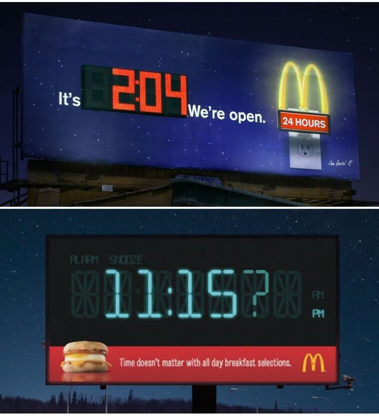
No matter the hour, no matter the minute, McDonald’s has a range of meaty options. They are even trying to have veggie burgers, these days. They just want you to pay and stay, don't they?
The Results Will Look as Natural as the Sunset
The science of hair dye is actually more complicated than it seems. Human hair has secret shades of red, blue, and yellow deep inside the strand. When it all blends together, we get a brown, black, red, or blond with interesting highlights in the sun. Dying hair can often look unnatural because of these missing elements. But Kolston is a brand of hair dye that wants you to know they've got that covered.
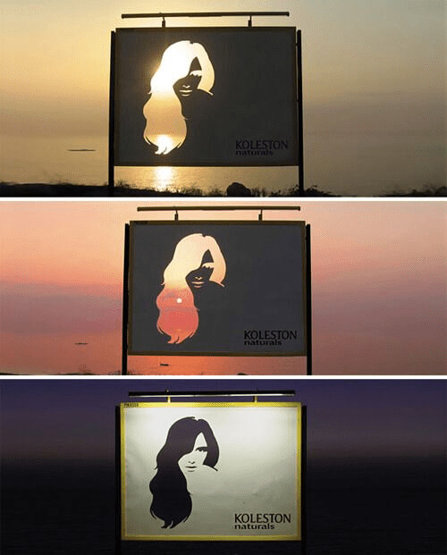
Allegedly, they've addressed the issue chemically in their formulations. To show how natural they look, they used a cutout of the sunset to show you different colors in the sky you already love.
They Say It Is Refreshing at Every Temperature
On a summer day, it always refreshing to drink something bubbly. Whether you like regular or diet, Coke is a great choice when things get steamy. But how do you know it's hot enough? Maybe this billboard can answer that once and for all. No matter the temperature, the digital reader says right now is the perfect time to drink Coca-Cola. But that's exactly what they would say if they were trying to sell you something.
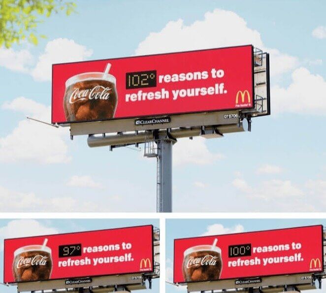
Totally suspicious. And upon close inspection, we can see this is a brand partnership with none other than Mcdonald's. We're not surprised! Both have incredible billboards, time and time again.
We See Big Potential for Men Here
Hair loss is a quiet problem for millions of men. Some accept their fate, and let it all go., Others try to hang on to the few strands they have left, and end up with a terrible combover. Thanks to modern technology, that's not a foregone conclusion anymore. Take Hairclub for men. The brand has been all over TV for decades promising results. And now, here they are on a billboard, showing a before and after that is sure to scare the steadiest male drivers.
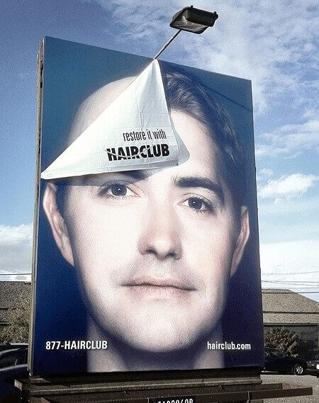
Hairclub is here to help, though. Don't crash just yet! According to the company: "We provide nearly a dozen different time-tested, proven solutions in three categories – regrowth, replacement, and restoration. Our replacement options are non-surgical and ideal for people who wish to improve or change the look of their hair instantly." Sounds promising!
They're at It Again With This Extra-Extra-Large Fry
McDonald’s just won't quit. Despite all the bad PR for fast food in recent years, they have no intention of putting away the potatoes. Today, they have a giant eye-catching sign. Pressed to the glass of a skyscraper, they depict a chain of people dangling down to snag a fry. The danger didn't stop them. The message seems to be: Anything to get a taste! How far would you go for a fry?
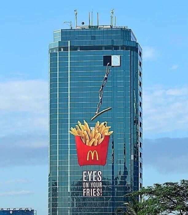
We're not sure we are willing to take this kind of risk for a salty treat. But luckily, we don't have to do that. Odds are, there's a McDonald’s drive-thru five minutes away, in any direction in the world.
Working Out With Cranes Sure Looks Promising
Cities are always moving and changing. Gentrification and repair make construction a fact of urban existence. It can get noisy and ugly looking, in the process. Can a clever ad mask the mess? Here, we say yes. The construction nuisance on the top of this building has been integrated into an ad. Look at the cranes, ad how they double as workout equipment for this gym campaign. The placement is genius!
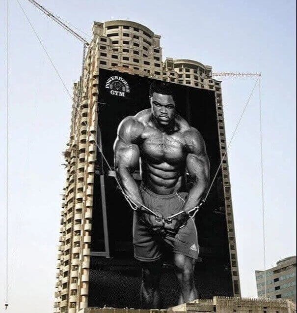
The image is powerful, too. It's no wonder this fellow is so ripped. Using giant construction equipment is sure to pump up your muscles. Hopefully, the gym offers the same results!
Go Ahead and Taste the Bubbles Now
This Coca-Cola ad has seriously gone the extra mile. Usually, we have to imagine the flavor of a beverage being advertised. But today, we don't have to do that. The soda is a part of the ad, and a container is attached to the billboard. A swirly straw flows out of it and offers the crowd below a taste. It's totally interactive. Have you ever seen a concept like this?
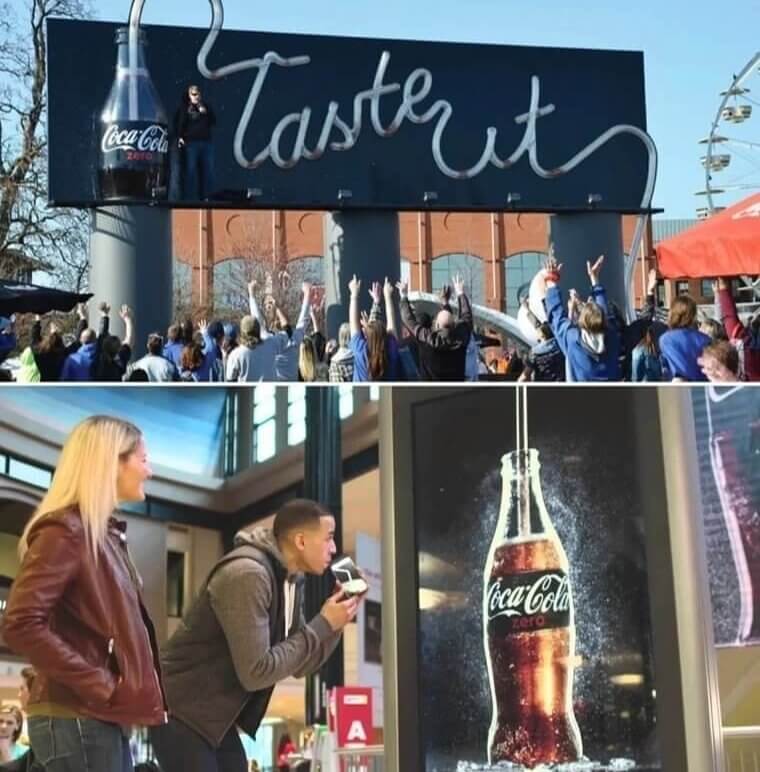
We know we haven't. It seems like an expensive stunt, just to sell a little bubbly. But we'd like to see more beverage companies try this. Vodka, chocolate milk, are you listening?
These Blocks Blend Into the Sky Quite Nicely
We're never going to let go of our LEGOs. We all have fond memories of playing with those interlocking plastic bricks. They just snapped together so perfectly. Whole worlds could be built out of them — if you had the time and patience. But admittedly, we have moved on to other hobbies as adults. The brand doesn't want drivers to forget they are out there in case they have their own kids. Ths billboard got our attention!
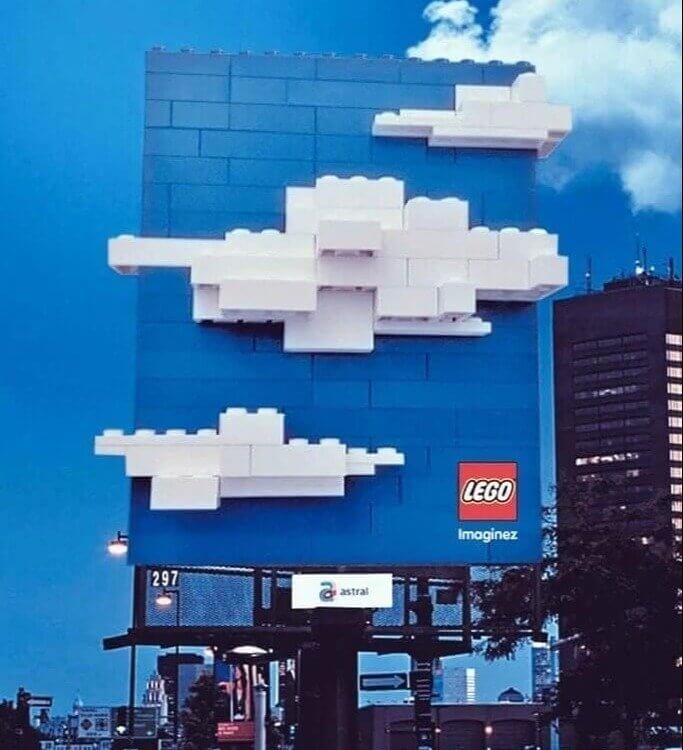
The sign is simple. It's just white clouds on a blue sky background. But it's special because it has been constructed to match the real sky so perfectly. You did it again, LEGO!
Even the Other Ads Can’t Resist
Have you ever shared a bottle of cold coke with a pal? We know we have. Just because there's only one doesn't mean it can't be fun. Coca-Cola created an ad campaign in the subway that demonstrates how tempting they know their product can be. The other signs seem to be sneaking a sip from either side of their ad. We're not surprised! How did they come up with the idea?
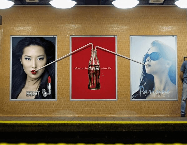
Perhaps they saw that three slots were a good price, and they wanted to dominate the space. It certainly makes a statement, taking up the whole metro wall. No room for Pepsi, here!
Reminisce Right on the Highway as You Drive
Racing tiny toy cars was a joy for many a boy. The brand of choice was certainly Hot Wheels. They're still around, and they are still going strong. With every real-life model in fun size form, the brand's success is well-deserved. But every once in a while, they take out ads to make sure you don't go generic. Here is an incredible campaign NASCAR never even tried. Their billboard is connected to a stretch of highway. Love that loop!
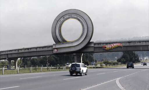
Sadly, drivers can't try it out in reality. Gravity won't allow it at this speed and angle. But it does get you thinking. Why did we ever stop buying Hot Wheels?
This Ad Uses Real Spotlights To Show Off
The tech on cars these days seems to be improving by the minute. Take the Mini Cooper, for example. Now, the model comes with Xenon headlights, also called High Intensity Discharge light. What does that mean? Well, it means that color is a bit bluer than the white lights on traditional vehicles. This spectrum of light actually is more effective than the normal builds on basic cars. It lights up more the road!
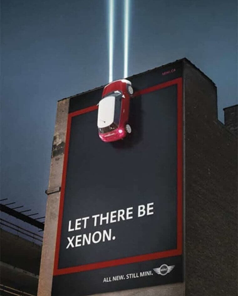
Sounds good. But how can Mini Cooper get the word out about this innovation? Here, the billboard has installed spotlights that shine into the night sky to get your attention. Did it work? We think so.
This Movie Blends Into Its Environment for a Reason
Many were terrified when they saw the film “The Day After Tomorrow”. The action-thriller showed a bunch of apocalyptic events after Earth went into another ice age. Apparently, cold is not the only problem in that situation. But how could the studio convince folks to come to see a horror movie about the weather? Dennis Quaid and Jake Gyllenhaal were not enough. They resorted to creative billboards. Look at this submerged sign!
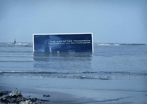
Observers can see an ominous message above a city skyline. Instantly, they wonder: Is that what happens in the script? Imagine a skyscraper, all the way under the sea. It's frightening!
These Folks Really Proved Their Point Here
According to researchers, stuttering is a problem that affects about five percent of all children. But most of them grow out of it or get proper treatment, so we may not know that it's so widespread. One organization decided to publicize the issue a bit with this billboard campaign. The Dutch Stutter Foundation created a triple sign on the road for people to ponder. Visually, it's like a version of stuttering!
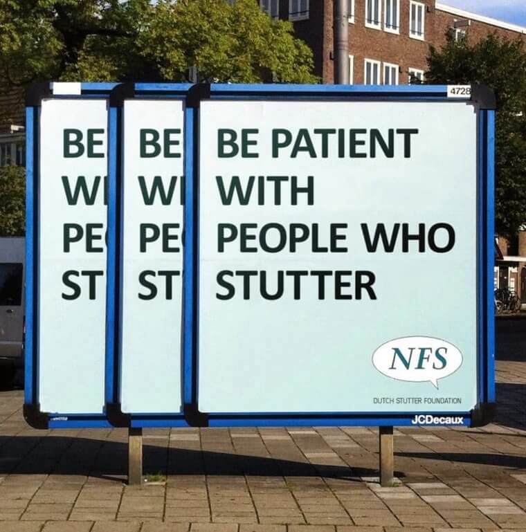
Be patient with people who stutter, the sign says. It's come common than you think. For example, you might be surprised to learn that Marilyn Monroe stuttered as a child. Elvis Presley stuttered a bit as an adult, and it can be heard on some vintage recordings. Who knew?
We Know You Always Wanted To Be the Tiny Car
We all loved playing with tiny cars as kids. But we never expected to be transformed into a toy ourselves on the morning commute. The madness! This ad by Hot Wheels does exactly that, and it's causing quite a stir. The boy perched on the overpass seems to be sizing up the drivers he wants to grab. Zoom zoom, vroom vroom. A lot of unsuspecting folks are about to take a surprise detour.
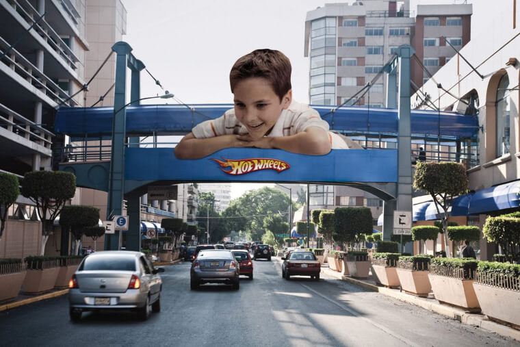
Just kidding, that's all impossible. It is a clever way to get our attention on the road, though. No other toy car company goes the extra mile like this, literally or figuratively.
This Brand Illustrates the Pain of a Headache Pretty Directly
If you've ever had a headache, you might describe it as pounding. Or maybe you would say your head is killing you. Tylenol is one of the most popular medicines on the market that address this ailment. And they want you to know that they understand how you've been feeling. Here, they got a real wrecking ball and smashed it through a picture of a human head. Feel the empathy, much?
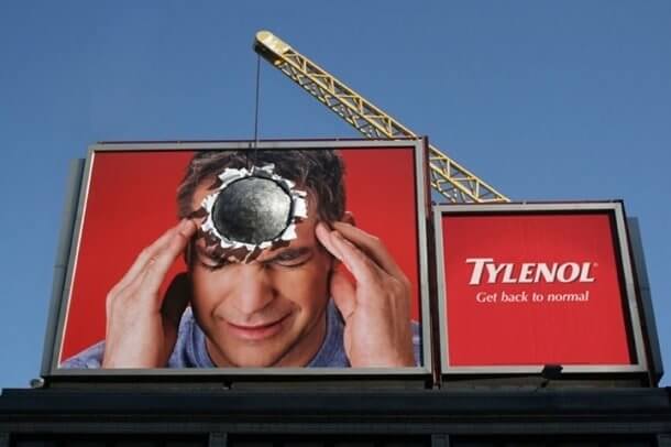
Tylenol claims to be the best medicine for serious headaches like this one. The billboard certainly gets your attention with that claim. But Advil fans might disagree. That stuff does the job, too!
They Showed Us How They Could Tackle Any Maze
We don't often think of DHL, as a cool company. We're not even sure what it means to be a hip delivery service. But this giant billboard maze is making us reconsider our bias. The 3D structure has a ball rolling around and works as a metaphor. Just like the service, this ball rolls smoothly from point A to point B. Well, that's just the kind of courier we want!
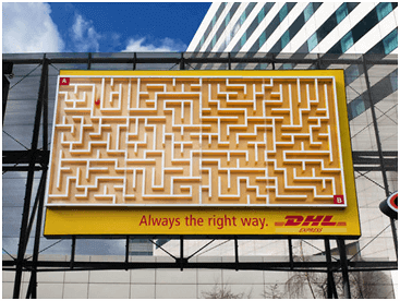
In real life, there are probably mishaps from time to time. But as long as we keep our eye on the ball here, we could be convinced by their claims. It's hypnotizing us to hate the Post Office. Frankly, we already did!
